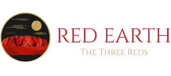
01 / The ring
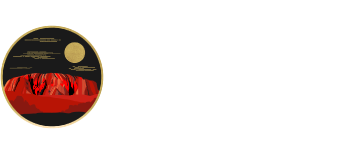
A closed circle rather than a shield or a crest — read as a horizon line, or as the boundary of a site. Ochre quarries like Wilgie Mia weren’t open landscape; they were specific, bounded ground people travelled toward. The ring says the same about this name.
02 / The gold moon
Gold against black, set off-centre rather than symmetrical. It reads as night over the interior — the hours when the desert’s heat breaks and the red ground goes almost black, which is closer to how the outback is actually experienced after sundown than any postcard sunset.
03 / The mesa
A flat-topped formation rather than a generic peak — the silhouette family Uluru and Kata Tjuta belong to: sediment laid down, then lifted, then worn back down by an almost incomprehensible span of erosion. The shape itself is a geology lesson.
04 / The contour clouds
Faint horizontal strokes above the mountain double as sky and as topographic survey lines — the kind of marks that show up on a geological map charting elevation and mineral strata. A quiet nod to the fact that this brand is naming a rock formation as much as a colour.
05 / The wordmark
An engraved serif with weight and a bit of grit in the texture — built to sit on a surface, not float over one. It’s set in the same rust red as the iron oxide it’s named after, not a designer’s approximation of “earthy.”
06 / The Three Reds
The subtitle and the three names beneath it are the only part of the mark that isn’t geology. They’re the lineup this identity was built to sit above: three distinct reds under one name, same logic as three strata in one core sample.